Brand Identity Guidelines
Typography
Typography is a cornerstone of the Cognism identity system.
What's on this page
Marketing Font
We use Roobert in our brand identity. This versatile font family allows us to maintain consistency across all our communications while ensuring clarity and readability.
Roobert
Weights & Styles
To ensure coherence, we adhere to a restrained approach in selecting font weights and styles. Within the Roobert family, we primarily utilise Semibold and Medium variants for our brand identity.
Roobert
SemiBold
Medium
Regular
Usage
Here we will find some good and bad practices regarding the use of typography that will help you in your layouts and compositions.
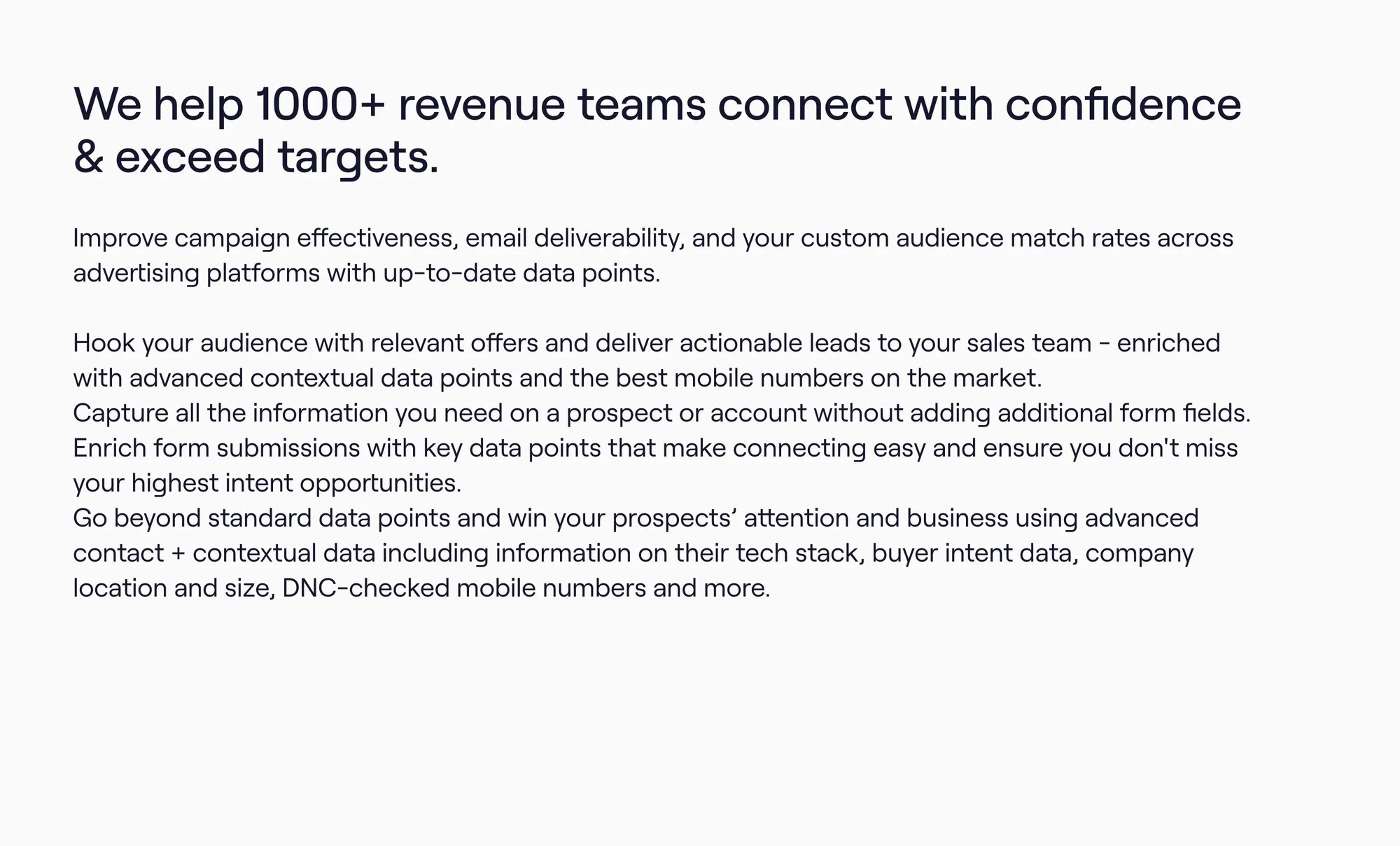
❌ Don't
Use more than 5 text sizes in one composition or put text blocks too close to one another
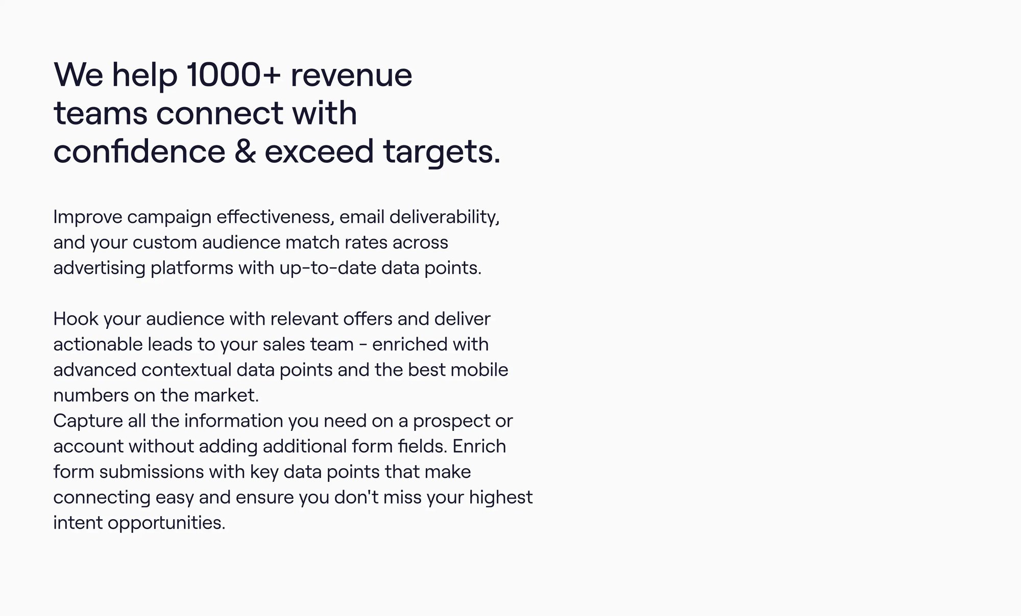
✅ Do
Create hierarchy using different styles and colours and leave enough space in between each text block

❌ Don't
Align the text to the middle or to the right

✅ Do
Always align the text to the left
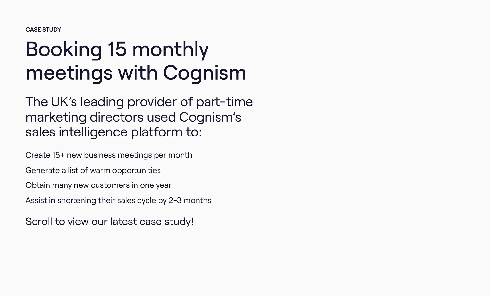
❌ Don't
Use more than 5 text sizes in one composition or put text blocks too close to one another
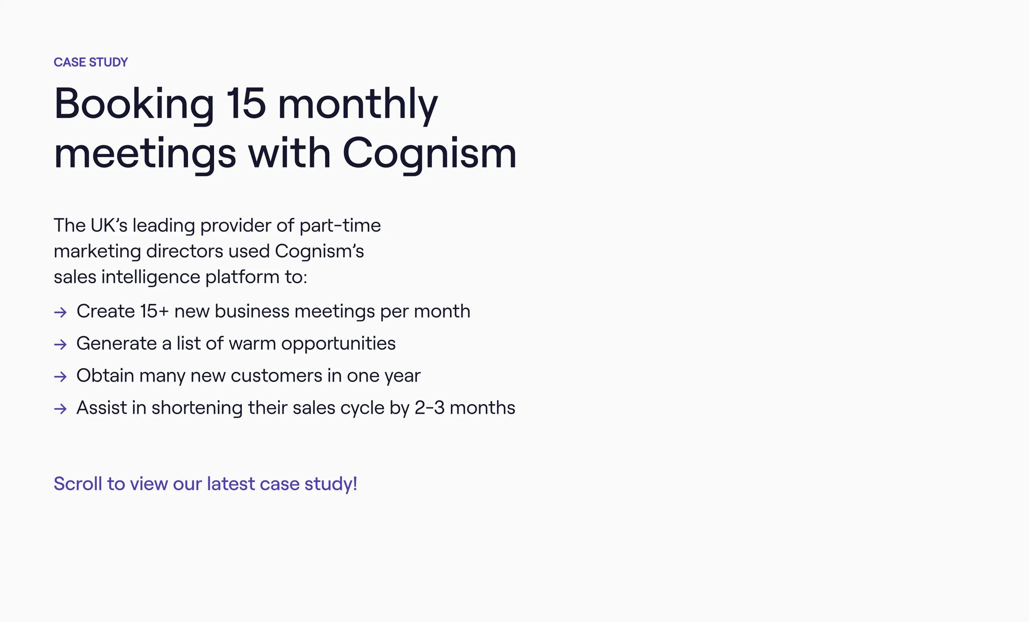
✅ Do
Create hierarchy using different styles and colours and leave enough space in between each text block
Download Roobert font
Have any questions?
If you have any questions regarding the content of this guide or need assistance ensuring your communication aligns with the Cognism brand, please reach out to our brand team.